The Importance of Responsive Design for Modern Websites
Busy Web Projects – Keen to Responsive Designs
In today’s digital age, a business’s website is often the first point of interaction with potential customers. As technology and user behaviors evolve, having a website that is accessible, functional, and user-friendly across all devices has become a critical factor in success. This is where responsive design (RD) comes into play.
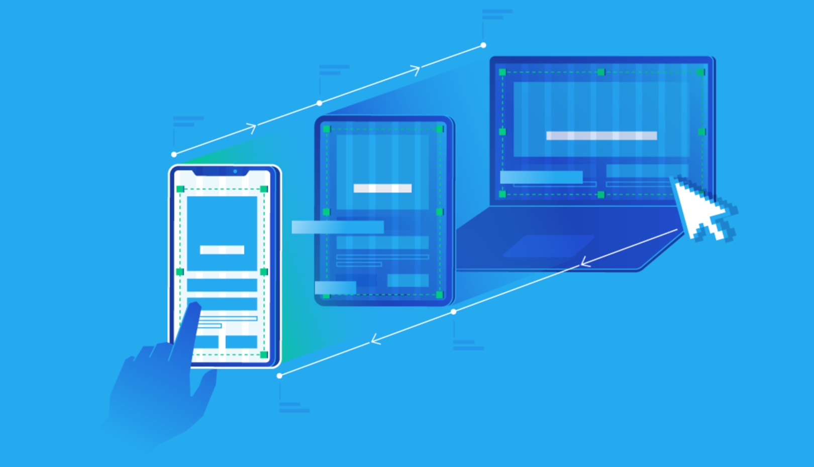
Responsive design refers to a web design approach that ensures a website functions smoothly on a variety of devices — from desktops and laptops to tablets and smartphones. Instead of creating separate versions of a site for each device, responsive design enables a single website to adapt and look great no matter what screen size it’s viewed on.
Here’s why responsive design is so crucial for today’s websites:
1. Improved User Experience
One of the most important aspects of responsive design is how it improves the overall user experience (UX). Websites that are optimized for different screen sizes ensure that visitors can navigate and interact with content without frustration.
- Mobile-Friendly: With mobile internet usage now surpassing desktop browsing, it’s imperative that websites are mobile-friendly. A site that doesn’t adapt to a mobile screen can make users zoom in and out, causing unnecessary frustration. This can lead to higher bounce rates and decreased engagement.
- Easy Navigation: A responsive site adjusts its layout, images, and navigation to ensure ease of use. Whether a visitor is on a phone, tablet, or desktop, the content remains legible and easy to navigate without horizontal scrolling or zooming.
Let us know if you have a project in mind
2. Boosted SEO Rankings
Search engines, especially Google, prioritize mobile-friendly websites in search results. In fact, since 2015, Google has used mobile-friendliness as a ranking factor in its algorithm. This means that websites with responsive design are more likely to rank higher in search engine results pages (SERPs) compared to those that aren’t optimized for mobile devices.
- Mobile-First Indexing: Google’s “mobile-first indexing” means it primarily looks at the mobile version of a website when ranking it in search results. If your website isn’t responsive, you could be penalized, even if it looks great on a desktop.
- Improved User Metrics: Websites that are responsive are likely to keep users engaged longer, which leads to better user metrics such as reduced bounce rates and increased time on site. These metrics can also positively impact SEO.
3. Faster Load Times
In a world where consumers expect instant gratification, website load speed is crucial. Slow-loading sites can lead to high bounce rates and a poor user experience. Responsive design often results in faster load times, as the layout and images are optimized for different devices.
- Efficient Image Resizing: Responsive design techniques, such as adaptive image resizing, ensure that images are appropriately scaled depending on the device. This reduces the load time without compromising the visual quality.
- Fewer Redirects: A responsive website doesn’t require multiple redirects between different device-specific versions. This means less loading time and a more seamless experience for users.
4. Cost and Time Efficiency
Maintaining separate websites for desktop, tablet, and mobile devices is not only time-consuming but also costly. Responsive design offers a more streamlined and cost-effective solution, as it allows businesses to maintain and update a single website that automatically adjusts to different screen sizes.
- One Website for All Devices: Instead of managing multiple versions of your website, responsive design requires only one website, saving both time and money. There’s no need for additional resources to update or maintain separate desktop and mobile sites.
- Future-Proof: Responsive design makes it easier to adapt to new devices in the future. Whether it’s a new tablet size, smartwatches, or a more advanced smartphone, a responsive website will automatically adjust to these new formats, ensuring longevity and continued usability.
5. Better Conversion Rates
A responsive website that provides a seamless user experience across devices can lead to higher conversion rates. When users find it easy to navigate, browse, and interact with content, they’re more likely to complete desired actions, whether that’s making a purchase, signing up for a newsletter, or filling out a contact form.
- Streamlined Checkout Process: For e-commerce websites, a responsive design ensures that the checkout process is just as easy on a mobile device as it is on a desktop. This can reduce cart abandonment rates and encourage more sales.
- Higher Engagement: When your website is responsive, it encourages more interaction and engagement. Visitors are more likely to share content, subscribe to updates, and become repeat customers if they have a positive experience.
6. Wider Audience Reach
As the number of devices with internet access continues to grow, responsive design ensures that your website is accessible to a wider audience. With different screen sizes, operating systems, and browsers in play, creating a one-size-fits-all design is no longer effective.
- Cross-Browser Compatibility: Responsive design ensures that your site functions correctly across different browsers, whether it’s Chrome, Firefox, Safari, or Edge. This ensures that users don’t face issues while navigating your website, regardless of their browser choice.
- Universal Access: Whether someone is visiting from a high-end smartphone, a mid-range tablet, or an older desktop computer, responsive design ensures they all experience the site in a consistent and user-friendly way.
7. Increased Competitive Advantage
Having a responsive website gives you an edge over competitors who may not have adapted to the mobile-first world. Businesses that embrace responsive design show that they are forward-thinking and committed to providing the best user experience, which can help differentiate them in a crowded marketplace.
Conclusion: A Must-Have for Every Business
In today’s digital landscape, responsive design isn’t just a nice-to-have — it’s a must-have. It ensures that your website is user-friendly, mobile-optimized, fast-loading, and prepared for future devices. By embracing responsive design, you not only improve your website’s SEO, but also enhance user experience, increase conversions, and maintain a competitive edge.
For businesses looking to stay relevant and grow in the digital space, investing in responsive design is one of the smartest decisions you can make. If you haven’t already optimized your site for all devices, now is the perfect time to do so. Your customers — and your bottom line — will thank you. Contact us today